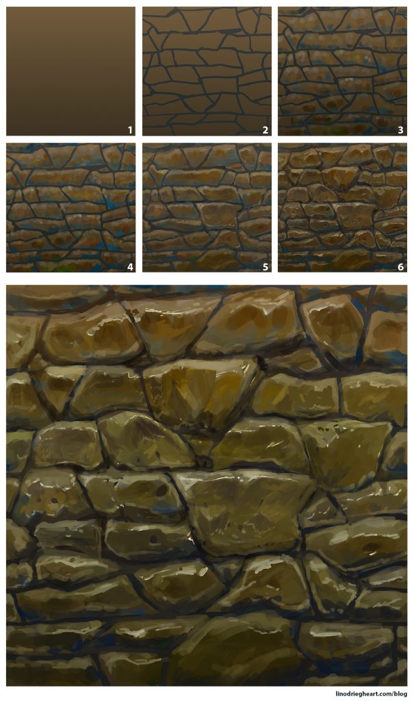
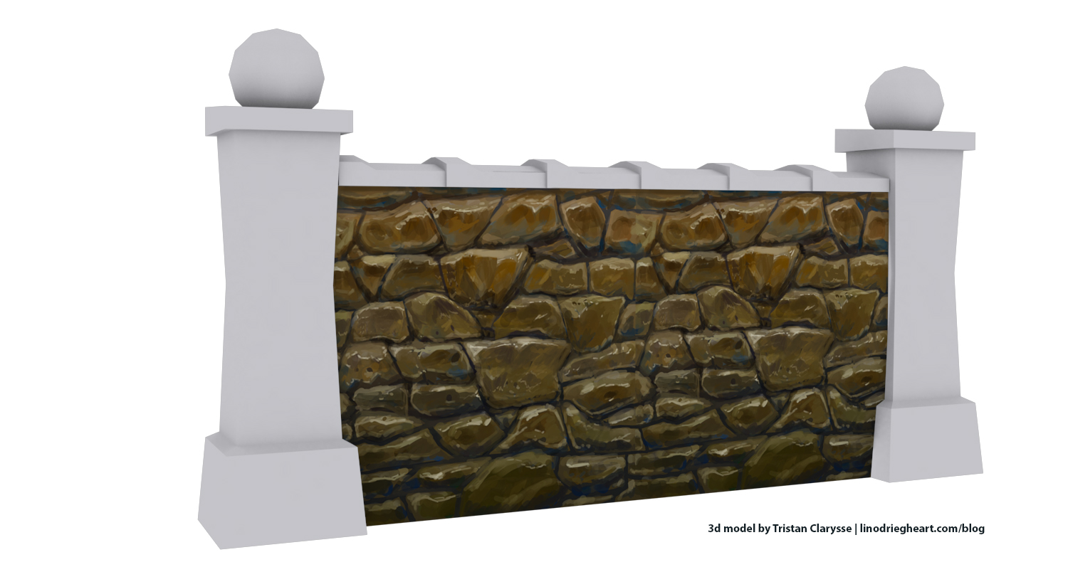
I made this tutorial about creating a hand painted stylized stone wall texture for the students that follow the Game Art 1 course at Digital Arts and Entertainment. In Game Art 1, students learn how develop their own reference prop through all the development steps, from 2d sketches to a finalized 3d model with hand painted textures.
In practice
When painting your stylized wall texture texture in Photoshop, you’re going to need the following:
- Gradient tool
- Brush and eraser tool (round brush with the pen pressure and shape dynamics variations)
- References
Make a new document in Photoshop. Set the dimension on 2048 pixels x 2048 pixels. Once finished, we’ll downscale the texture to 512 pixels x 512 pixels. That way, our final texture will be extra crisp
-
- Apply a linear gradient, starting from the bottom all the way to the top. Keep the darker value at the bottom of the wall
- Draw the lines that will make up the occlusion shadows and each separate rock. Look at your references and come up with interesting shapes and forms. Make sure not to make the lines too thick. Use the Offset filter (Filter » Other » Offset) to make the texture tile-able
- Add color variations to the individual rocks. Use warmer and lighter colors for the top planes as those planes will catch the warm sunlight. For the shadow areas you can use a colder and darker colors as a contrast. You can warm or cool down the main color you used for your gradient in step 2, or make the color variation more obvious by placing blues and yellows. Do try placing some pure greys as well. A grey will look cool on a warm color and warm on a cool color
- Blend the colors together. Keep an eye on your value structure by working in color and greyscale simultaneously. Work on the big and medium shapes first
- Work on your micro design by placing details and highlights
- Add a final contrast and color variation. At the bottom, you can make the stones darker, less saturated and a bit greener

Final tweaks
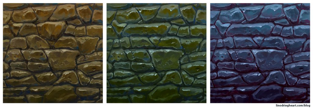
Take a step back and have another look at your final result. It happens that most of the contrast is gone or that your shapes are not interesting enough because of being too similar or odd looking. Luckily, by using various filters such as Levels, Hue / Saturation, Color Balance, and Color Lookup, we can tweak the end result. If you notice some parts need changes or more work, you can also rework them with your round brush.

Let me know if this technique was any worth to you!
